Current OS: A minimalist UI Design System
Nov 11, 2025
Overview
Current OS is a compact, modern design system I built to demonstrate my end-to-end ability to define visual foundations, system tokens, and reusable components. The goal was to create a calm, structured interface language that feels soft, functional, and human-centered while showcasing my technical Figma proficiency and design systems thinking.
Project purpose
This project was created as complete example of my visual systems capability. I focused on clarity, scalability, and craft: establishing consistent typography, color tokens, spacing logic, grid structure, and core components that can scale into real product UI.
Key considerations included:
Prioritize fundamentals
Build a system that feels modern and quiet
Keep the foundations flexible enough to grow into full UI flows later
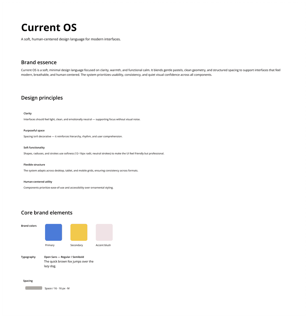
Brand essence
I defined Current OS as a system grounded in calm clarity. Its aesthetic is defined by breathable layouts, soft neutral palette, and functional warmth. Key pillars of the visual identity included:
Neutral-first palette with structured contrast
Pastel blush accent for approachable emphasis
Open Sans type system optimized for display and readability
Soft geometry (12–16px radii, light strokes)
Purposeful space that reinforces hierarchy
The result is a visual language that feels gentle, easy, clear and product-forward.
Objectives
Design a system that:
Understands context the way a photographer does
Recommends only from my personal film simulation catalog
Uses structured metadata and controlled AI reasoning
Eliminates hallucination and generic answers
Produces reliable, explainable guidance for every scenario
Brand overview
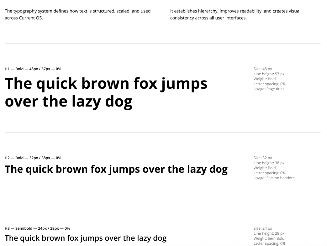
Typography system
I defined a full type scale with clear hierarchy, consistent line heights, and tokenized text styles for universal application across UI components and reading environments.
The system includes:
H1–H6 (bold and semibold variants)
Body Large / Default / Small
Label Medium / Small
Typography preview
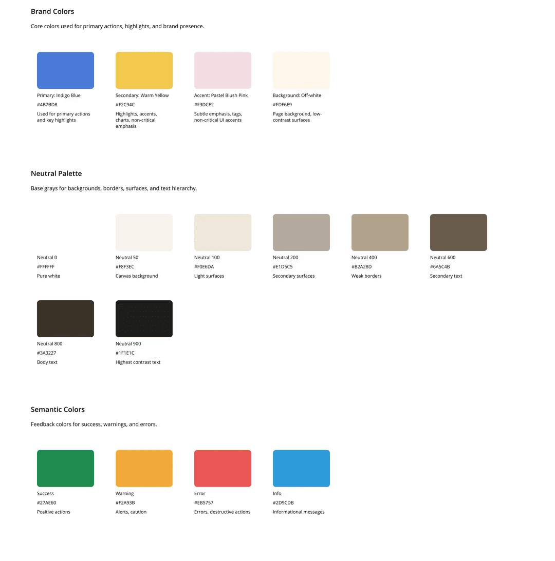
Color system
The color palette includes three layers:
Neutral scale (50–900)
Soft grays with smooth contrast steps for text, dividers, surfaces, and containers.
Accent color (Blush 50–700)
A warm pastel pink used sparingly for emphasis and interactive elements.
Functional colors (extension)
Space reserved for future states (success, error, warning), following the same tonal logic.
Each color token supports:
Accessible contrast
Flexible component styling
Breathable UI
Color system preview
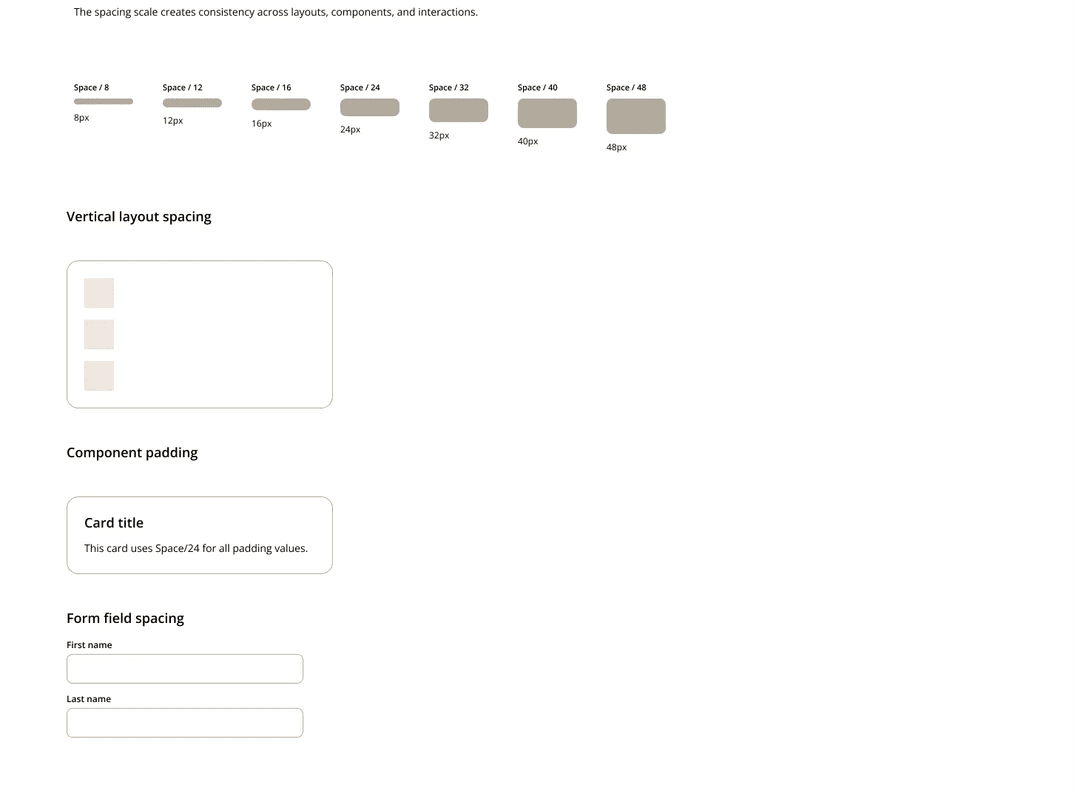
Spacing + Grid
I established a spacing scale based on 4px increments to create predictable, rhythmic layout structures.
Spacing scale (excerpt):
4 / 8 / 12 / 16 / 20 / 24 / 32 / 40 / 48 / 64
The grid system adapts across breakpoints:
Desktop: 12 columns; 80px margin; 24px gutter
Tablet: 8 columns; 40px margin; 20px gutter
Mobile: 4 columns; 16px margin; 16px gutter
This ensures consistent layout behavior while giving designers flexible composition options.
Spacing preview
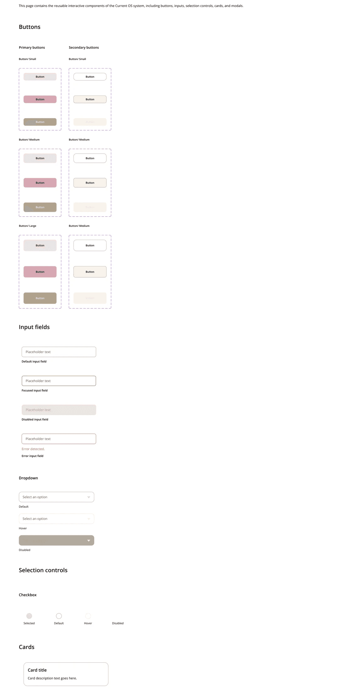
Core components
I started out with building a small but meaningful set of components that demonstrate interaction logic and system scalability. Components include:
Primary & secondary buttons (small/medium/large + full states)
Checkbox (4 states)
Inputs (filled + disabled)
Dropdown (default/hover/disabled)
Card component (default)
Each component follows standard:
Spacing tokens
Color tokens
Radii
Type scale
Interaction states
All are built as variant sets in Figma for real usability.
Component preview
What I learned
This project sharpened my ability to:
Build structured, scalable visual systems
Use Figma auto-layout and variants effectively
Translate abstract design principles into reusable components
Maintain consistency across typography, color, spacing, and UI patterns
Work fast while upholding clear craftsmanship
It was a great experience that enhanced my understanding and working knowledge of design systems through hands-on practice to align the combination of logic, clarity, hierarchy, and interaction thinking aligns with how I naturally approach product and UX design.